Thursday, May 29, 2008

Onward to Art Review


Ok, if you diddn't notice it has gotten very quiet over here. That is partially because I am working like a madman and have two small children, and partially because I have started a profile on Art Review magazine's online side. Check it out here. In the mean time, here are some examples of new work you will see on said site.

Tuesday, August 28, 2007

new city new job... at the FOG

Ok, been very silent over here at the inverse cube. This is because we moved to Los Angeles last month. I had to scramble to get my portfolio together and interview in LA, and got an awesome job out of the deal. I'm now working at Gehry Partners (as in Frank O. Gehry) on the Grand Avenue urban development in downtown LA. It's not the coolest Gehry project, but a great one in its own way. A 'background building' as they say at work. Now, don't start associating me with Gehry and Gehry design, I have my critical thoughts about what we are doing, but find that generally irrelevant. It's a great place to learn the future of architectural practice as it is being developed. Continuing to learn architecture practice on a project this complex can only help. Plus it's right in town, so I can watch this one go up.

Saturday, April 07, 2007

Updated photos

I have updated the photos of the works noted 'second painting' and 'third painting'. It's really hard for me to get good photos without proper lighting, so this is the best I can do for now. I also added a more appropriate note to the work noted 'first painting'. It's curious to me that nobody has asked about titles. All of my paintings actually have titles. But they are secret right now. The drawings being studies are simply numbered.

Going too far?


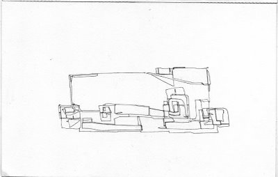
7x11 pencil on paper. Maybe this is pushing too far, or too obvious. I would like to develop this more subtly. I feel this is too direct. Or too Zaha. It will be a few months before I can keep moving on this, but I do know where I am going to go (provisionally).

Small Drawings (pushing)


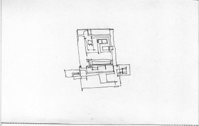
7x11 pencil on paper. Expanding on a side idea from the 'significant form' series. Here I am trying to push the SF in a particular direction.

Small Drawings (for professors)


7x11 pencil on paper. The same notion as the significant form drawings, only a fraction of the size. A couple of these were sent to my old professors as 'thank-yous' for writing letters of recommendation.

Monday, January 22, 2007

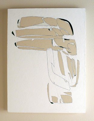
Third Painting


18x24 acrylic and pencil on canvas. ***New photo uploaded 04/2007.

Saturday, January 20, 2007

Second Painting


10x10 acrylic and paper on canvas. New photo uploaded 4/2007.

Monday, October 30, 2006

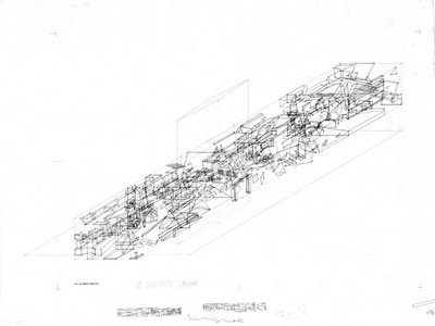
Stockholm Library Competition


I just finished this competition. The drawings are not what/how I wanted them to be, but I was very limited by time as well as the competition brief. The main text reads:

A WELL TEMPERED STORM / A WELL TENDED GARDEN:
The library is a model of the human mind - a violent and transformative storm. The mind is a mixing chamber of diverse thoughts, desires, constructions, and forms of knowledge. To live is to transform - to learn and grow.
The library is a mixing chamber of diverse peoples, media, and forms of information. The library lives to transform man - to cultivate.
The storm is tempered by both a calm center (the eye of the storm) and our constructed facade (shield/mask).
The calm center looks out through its facade to the greater world beyond and into the obscured depths of the sub-conscious storm within. It is by tending to these two views that we grow.
The Stockholm Public Library is an elegant yet diverse ground for mixing and growing. A little light helps.

Ok, thats not very clear. But there is also this quote from Haruki Murakami on there: "this storm isn't something that blew in from far away, something that has nothing to do with you. This storm is you. Something inside of you. ... one thing is certain. When you come out of the storm you won't be the same person who walked in." So maybe that helps to make sense of it. The storm sorta gets lost at the scale of the drawings. But I swear that it would be there in the details. Unfortunately that's not good enough for a competition.
Anyhow, I think that the general proposal regarding the site and existing building(s) is sound and strong. This whole storm thing is only if one digs a bit deeper... If anybody wants to see higher resolution PDFs just let me know.

Sunday, July 09, 2006

First Painting


32x48 pencil and acrylic on plywood.

Unideal Villa


shinkenchiku residential design competition (2002?). the text reads:

Unideal Villa

Give me ground to stand on and I will move the world.
-Archimedes

In the presence of your eyes only the inhabitants of the Unideal Villa have slipped from Logos , running free as one could in Hades. Such as it is in Utopia, one must willfully struggle from the good, wise and happy; quite the opposite from our world where eudaimonia is far from reach.

Like the Ideal Villa, here geometry regulates. This geometrric regulation is logos itself - the laying that gathers. Unlike the Ideal Villa, what is gathered is sensable, not an ideal object edified. Collage rewrites the idea of laying that gathers. What is gathered is not what can first be said, know, or even imagined. Collage is a machine for imagination, a mechanized imagination. It is a machine for slipping from structure, from language.

Reconfigure the world and you will have the world of man. I call this world Irreal.

These drawings are a beginning of play and imagination on these ideas. The end is nowhere in sight.

Exterminate all rationality.
-W.S.Burroughs

references to logos/the laying that gathers from Heidegger's analysis of Anaximander in 'Early Greek Thinking'.